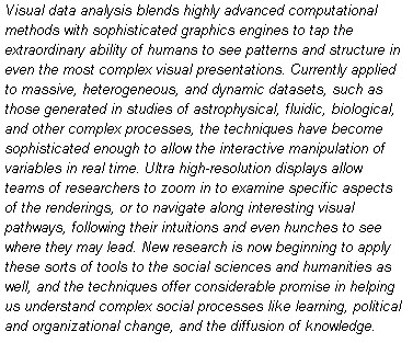
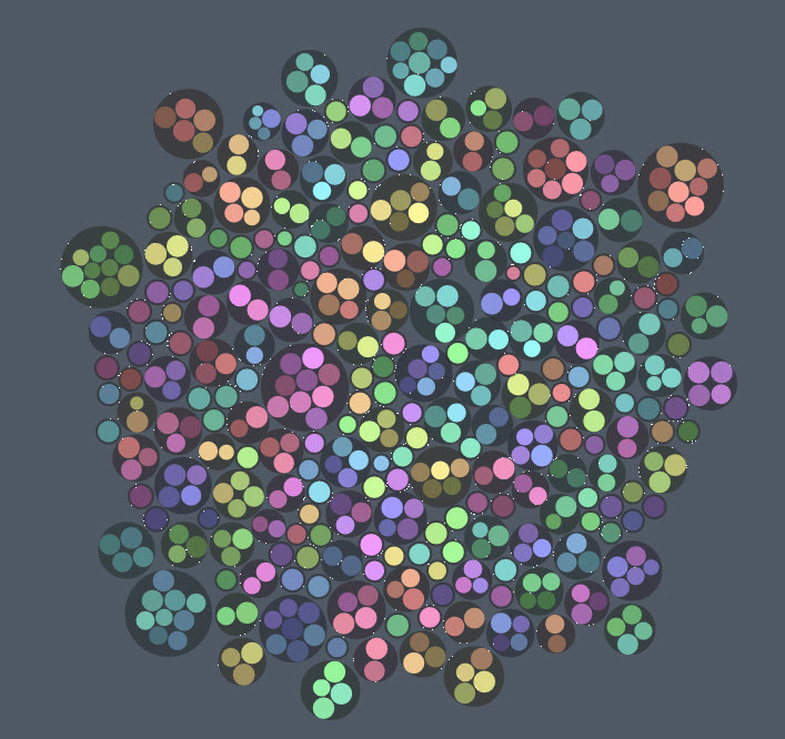
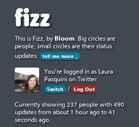
Fizz is one of the many ways to review and analyze online data. I am a visual learner. Naturally, I am intrigued with visual research and data analysis. The 2010 Horizon Report indicated that Visual Data Analysis will be impacting technology and learning in higher education in the next four to five years:
 Visualization tools like Many Eyes, Flowing Data, and Wordle are making statistics and data fun. These representations present actual facts and ideas in visual format to strengthen research and debates. Visualization tools help support learning and engagement for both educators and learners. Besides making meaning and giving access to facts, visualization allows learners to personalize and engage with data. A fellow doc student, Kevin Guidry, shared a great example of how to represent an online community in Twitter with his Visualization of #SAchat Data. Seeing this data allows more people to understand the dynamics of a community and how they connect online.
Another great proponent of visual statistics is Hans Rosling. Hans is bring sexy back with statistics as he details his love of stats on the one-hour BBC documentary The Joys of Stats and his non-profit project Gapminder. For those of you who think statistics is a dirty word, I encourage you to take a gander at this one. If you are not afraid, I encourage you to get more visual with your research, learning and data. Here are a few resources to get you started – please comment and share more tools that you use & love to visualize data:


